


Pix Material Expressive Icons
PashaPuma Design
Changing an Android home screen can be surprisingly difficult when the icons belong to different visual styles. I noticed that problem immediately when testing Pix Material Expressive Icons: the main appeal is not simply having more artwork, but making a mixed collection of apps feel closer to one coherent design. It is a personalization app from PashaPuma Design, built around vibrant adaptive icons, Material You styling, and stronger Monet-inspired color treatment.
My first impression was that it makes the most sense for people who already care about their launcher layout. If you treat the home screen as a practical dashboard and do not mind inconsistent icons, this may feel unnecessary. If you use a compatible launcher, enjoy matching wallpapers with icons, or regularly tidy your shortcuts, it offers a more deliberate way to finish the look.
The app is listed at $1.99, with optional in-app items ranging from $0.99 to $9.99 each. That makes the purchase decision fairly straightforward, although the value depends heavily on whether your launcher can actually apply the icon style properly. It is rated for Everyone, supports Android 8.0 and later, and the current release is 11.9.5.Build.
How I used it as a daily icon workflow
I started with a simple baseline: keep the home screen limited to the apps I open most often, then apply the icon pack instead of rearranging everything at once. This is the least frustrating way to judge an icon pack because it separates the visual change from the temptation to rebuild the entire launcher. After applying the icons, I could see which shortcuts looked naturally integrated and which ones still needed attention.
The adaptive approach is especially useful when the launcher already supports shaped icons. Rather than forcing every icon into a completely unrelated illustration style, the pack aims for a more unified Material-inspired appearance. The result depends on the launcher and the icon shape you select, but I found the overall effect more convincing when I used one shape consistently across the main screen.
Related News

Why WhatsApp Messenger Still Makes Everyday Communication Feel Easy

Jurassic World: The Game Is the Better Dino Tycoon for Strategic Players

Threads in Real Life: Who Should Join, Lurk, or Leave

How SHEIN Turned Shopping Into an Endless Content Feed

How to Make Fortnite Feel Smarter on Mobile

Should You Switch to Microsoft Outlook on Mobile?
That consistency matters more than choosing the most colorful option. A bright icon can look excellent by itself and still make a home screen feel noisy when surrounded by several other bright icons. My practical advice is to begin with the smallest screen you use every day, usually the first home page, and leave secondary pages alone until the visual hierarchy feels right.
One useful habit is to place frequently used apps in a fixed row and let the icon treatment do the organizing. For example, I would keep communication, maps, music, and work tools in predictable positions rather than relying on color to remember where they are. The expressive colors then become a visual aid instead of decoration that slows me down.
This also answers an important question: is it a full launcher? No. I treated it as an icon customization layer, not as a replacement for the launcher itself. Your launcher remains responsible for grids, gestures, folders, widgets, and page behavior. The pack becomes worthwhile when those existing launcher controls are already comfortable and you want the icons to match them better.
Gallery
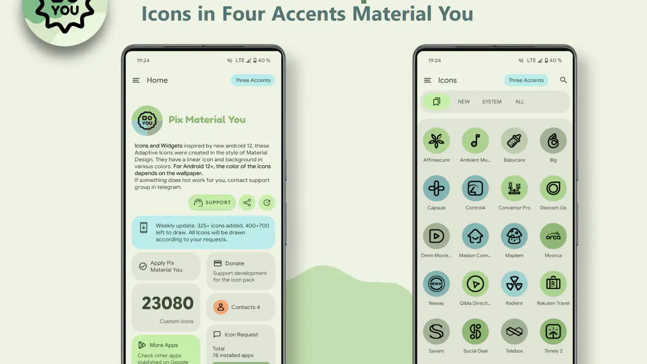
Settings I would check before judging the result
The first setting worth checking is the icon shape offered by your launcher. Adaptive icons can appear very different inside a circle, rounded square, squircle, or another mask. If the icons look cramped, overly padded, or visually uneven, the problem may be the selected mask rather than the artwork. I would test two or three available shapes before deciding that the pack does not suit the phone.
Next, compare the icons against your wallpaper in both light and dark surroundings. Material You-style color can look balanced on one background and lose contrast on another. A pale wallpaper may make yellow or green icons feel soft, while a darker background can make the same palette appear much more vivid. I prefer choosing the wallpaper first, then adjusting the icon shape and layout around it.
It is also worth checking how your launcher handles apps that are not covered in the same way as the main set. Mixed icons are one of the most common reasons an icon pack feels unfinished. I found that keeping less-used apps inside folders reduces this visual interruption. The first page can remain polished while rarely opened utilities stay accessible without demanding individual attention.
Do not forget shortcuts created by other apps. A launcher may display a shortcut differently from the regular app icon, particularly when it comes from a browser, automation tool, or widget system. If one shortcut refuses to match, I would avoid rebuilding the entire layout. Move it to a secondary page or folder and preserve the cleanest arrangement where it matters most.
The developer is PashaPuma Design, and the app has an average rating of 4.4 from around 1.1 thousand ratings. I see that as a useful sign that the concept connects with its intended audience, but it should not replace checking launcher compatibility on your own device. Icon packs are unusually dependent on the software surrounding them, so the same package can feel polished on one setup and awkward on another.
Repeatable patterns that make the pack more useful
The best improvement I found was to create a repeatable reset routine. Whenever I install several new apps, I do not immediately place them on the first page. I first check whether their icons fit the existing style, then decide whether they belong in a folder, on a secondary screen, or in the app drawer. This prevents one-off additions from gradually undoing the visual consistency I wanted in the first place.
Folders are especially valuable with a colorful icon pack. I used them for categories that contain many visually different apps, such as shopping, travel, and finance. The folder preview keeps the group available while reducing the number of competing icons on the main page. This is a better compromise than trying to make every installed app equally prominent.
Another effective pattern is to reserve expressive colors for recognition rather than decoration. I would place apps that serve different purposes next to each other, then use their distinct colors as secondary cues. That makes it easier to spot a navigation app or a messaging app without reading every label. It works best when the grid remains stable; moving icons frequently weakens the benefit.
For a workday setup, I would keep a compact first page with only essential communication, calendar, notes, and task tools. Leisure apps can move to another page, even if their icons are attractive. This approach lets the pack support focus instead of turning the home screen into a gallery. On weekends, I could still reach those apps quickly without changing the underlying icon system.
Widgets deserve some restraint. A large widget beside highly expressive icons can make the screen feel crowded, especially if the widget uses a different color language. I found that one strong widget and a little empty space usually looked better than filling every available cell. The icon pack cannot solve an overloaded layout, so spacing remains part of the design work.
People often ask whether a paid icon pack is better than using the default adaptive icons already included with Android. In my experience, the default option wins for simplicity and broad compatibility. This pack is more appealing when you want a stronger visual identity and are willing to spend time selecting a mask, arranging folders, and keeping the layout disciplined. The trade-off is control versus convenience.
Where the expressive style reaches its limits
The largest limitation is not the color treatment itself; it is the dependency on launcher support. Android customization is not completely uniform across devices, and an icon pack cannot guarantee that every launcher will expose the same controls. Before paying, I would confirm that your launcher supports third-party icon packs or adaptive icon customization. If it does not, the purchase may not deliver the experience you expect.
There is also a difference between a beautiful preview and a useful daily screen. Strong colors can make an icon memorable, but too many saturated elements compete for attention. I had to reduce the number of visible shortcuts before the design felt calm. Users who prefer monochrome, understated, or highly minimal home screens may find this style more energetic than they want.
Another trade-off appears when you change wallpapers often. A palette that works with one background may not work with the next, so frequent wallpaper changes can create extra adjustment work. I would recommend it more confidently to someone who keeps a wallpaper for a while than to someone who changes the entire theme every few days.
The price also deserves context. At $1.99, it is a small purchase compared with many broader customization tools, but it is still money spent on one layer of the home screen. Optional purchases can range from $0.99 to $9.99 per item, so I would avoid assuming that the initial payment automatically covers every possible addition. Decide first whether the core icon style fits your setup, then consider anything extra.
The app has over 10 thousand installs, which suggests a real audience without making it a universal choice. Its release date was September 5, 2021, and the current version indicates ongoing versioning rather than a one-time static package. Still, I would judge it by the current behavior of my launcher, not by the age of the project or the number of installations.
Who should skip it? I would skip it if you use the stock launcher with no third-party icon support, dislike vivid icon treatments, or want automatic perfection without touching folders and layout settings. I would also avoid it if your priority is a complete theme system with matching lock-screen controls, notification styling, and system-wide redesign. This app is focused, and that focus is both its strength and its boundary.
My practical verdict after settling on a routine
After using it as part of a repeatable setup rather than applying it once and forgetting it, I came away positive. The strongest result came from combining three simple choices: one consistent adaptive shape, a restrained first page, and folders for apps that would otherwise introduce visual clutter. None of those choices is hidden magic, but together they make the icon pack feel considerably more intentional.
I especially recommend it to Android users who enjoy Material You colors but want more personality than the default system icons provide. It is also a good fit for people who frequently reorganize their home screen and want a visual rule to guide those decisions. The expressive treatment gives the layout a recognizable character without requiring a complete launcher replacement.
My recommendation is more cautious for iOS users or anyone expecting identical behavior across platforms. The listed minimum operating system is Android 8.0, so this is fundamentally an Android-focused purchase. If your device or launcher does not support the relevant customization path, the attractive concept will not compensate for the setup friction.
In everyday use, I would describe Pix Material Expressive Icons as a finishing tool rather than a dramatic transformation. It rewards users who care about small details: matching the mask to the wallpaper, keeping the first page purposeful, and accepting that not every app needs to be visible all the time. The result is strongest when the icon pack supports a routine you already have instead of becoming another project to maintain.
For me, the deciding question is simple: do you want your home screen to feel deliberately designed, and are you comfortable making a few launcher decisions to get there? If yes, the $1.99 entry price is reasonable for a focused personalization app. If you only want icons to change automatically with no further thought, the default Android experience or a simpler free alternative will probably be the better choice.
Overall, I would recommend it to experienced Android customizers and to anyone willing to spend a few minutes refining their layout. The vibrant adaptive look is distinctive, the Material You influence gives it a current feel, and the color emphasis can make a stable home screen easier to scan. Just keep expectations realistic: the quality of the final result depends as much on your launcher habits as on the icon artwork.
FAQs for Pix Material Expressive Icons
What is Pix Material Expressive Icons?
Pix Material Expressive Icons is an Android icon pack designed to give your home screen a modern Pixel-inspired appearance. It includes expressive, colorful icons with rounded shapes and a consistent visual style. The pack is intended for users who want to customize app shortcuts without replacing their entire launcher or installing a separate home-screen environment.
Which launchers are compatible with Pix Material Expressive Icons?
Compatibility depends on the launcher installed on your Android device. Pix Material Expressive Icons generally works with popular launchers that support third-party icon packs, including many customization-focused options. Some stock launchers may not apply icon packs directly, so you should check the launcher’s settings or the app’s compatibility information before downloading. Manual icon replacement may be available in certain launchers.
Does Pix Material Expressive Icons include icons for every application?
The pack may cover many popular Android applications, but no icon collection can guarantee support for every app, especially newly released, regional, or less common applications. When an icon is unavailable, the launcher may display the original icon or allow you to request a new design. Coverage can also change through future updates, so checking the latest changelog is recommended.
Is Pix Material Expressive Icons free to use?
Availability and pricing can vary depending on the version distributed through the official app store. Some features or the complete icon collection may require a one-time purchase, while certain versions may be offered free of charge. Before installing, review the store listing for current pricing, in-app purchases, advertisements, and refund conditions so you understand what is included.
Will using Pix Material Expressive Icons affect my phone’s performance or battery life?
An icon pack normally has a very small effect on performance because it mainly provides image assets and customization resources for your launcher. It should not noticeably increase battery consumption during everyday use. However, launcher behavior, animated previews, large wallpapers, or additional customization tools can affect resource usage. If your device feels slower, try disabling extra launcher effects or reducing visual animations.
Pros
- Large collection of Material You-style icons for modern Android setups.
- Works well with popular launchers
- including many customization-focused options.
- Consistent shapes and colors help create a polished home-screen appearance.
- Frequent updates can add support for newer apps and icon designs.
- Lightweight icon packs usually have minimal impact on device storage.
Cons
- Some app icons may remain unthemed and require manual replacement.
- Best results depend on using a compatible third-party launcher.
- The expressive style may not suit minimalist or highly realistic themes.
- Icon masking can make unsupported icons look less visually consistent.
- Certain launcher features may vary between Android devices and manufacturers.


